
this is where I'll begin
Hello world. My name is Nicole, I am 31, they/she. I hope you like my little website cause I had a lot of fun making it. This page is best viewed on desktop! I'm back on the internet and ready to code, bitches.
Class discussion
What I'm Reading

other stuff I've read
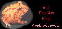
Argentinian Horned frogs seem to have been designed for the sole purpose of eating as much as possible. They appear to consist of two main parts: a mouth and a stomach. This is probably where they got the nickname "PacMan". Their needs are fairly simple, a warm habitat in a simple plastic box or aquarium with some shallow water and a few rocks so that they can laze around all day suits them just fine. They don't mix well with other frogs, even in their own species, as they are just as likely to eat them.
I Am A: Chaotic Good Human Druid (4th Level)
Ability Scores:
Strength-11
Dexterity-11
Constitution-13
Intelligence-13
Wisdom-13
Charisma-16
Find out What Kind of Dungeons and Dragons Character Would You Be?, courtesy of Easydamus (e-mail)